From a cleanup brief to a new way to choose data access.
A core widget in Collibra's Data Marketplace. It used to show one port per tab; now consumers compare ports and request access in one place.
Product Designer — full design cycle on this feature.
01Context
What someone is choosing here
Collibra helps large organisations find, govern and use data. In its Data Marketplace, a consumer opens a data product — a package built from context, data and controls, sitting behind one access point — looks at the output ports that deliver it, and checks each port's data contract before requesting access.
The viewer sits at that last step: is this the right data, and can I request it?
10-second version
Brief
“The widget feels chaotic. Clean it up.”
Move
I made each port a scannable card in one visible list, with detail in a panel beside it.
Outcome
Shipped. A consumer can now compare ports and request access without leaving the page.
Starting point
Hard to read and hard to scale
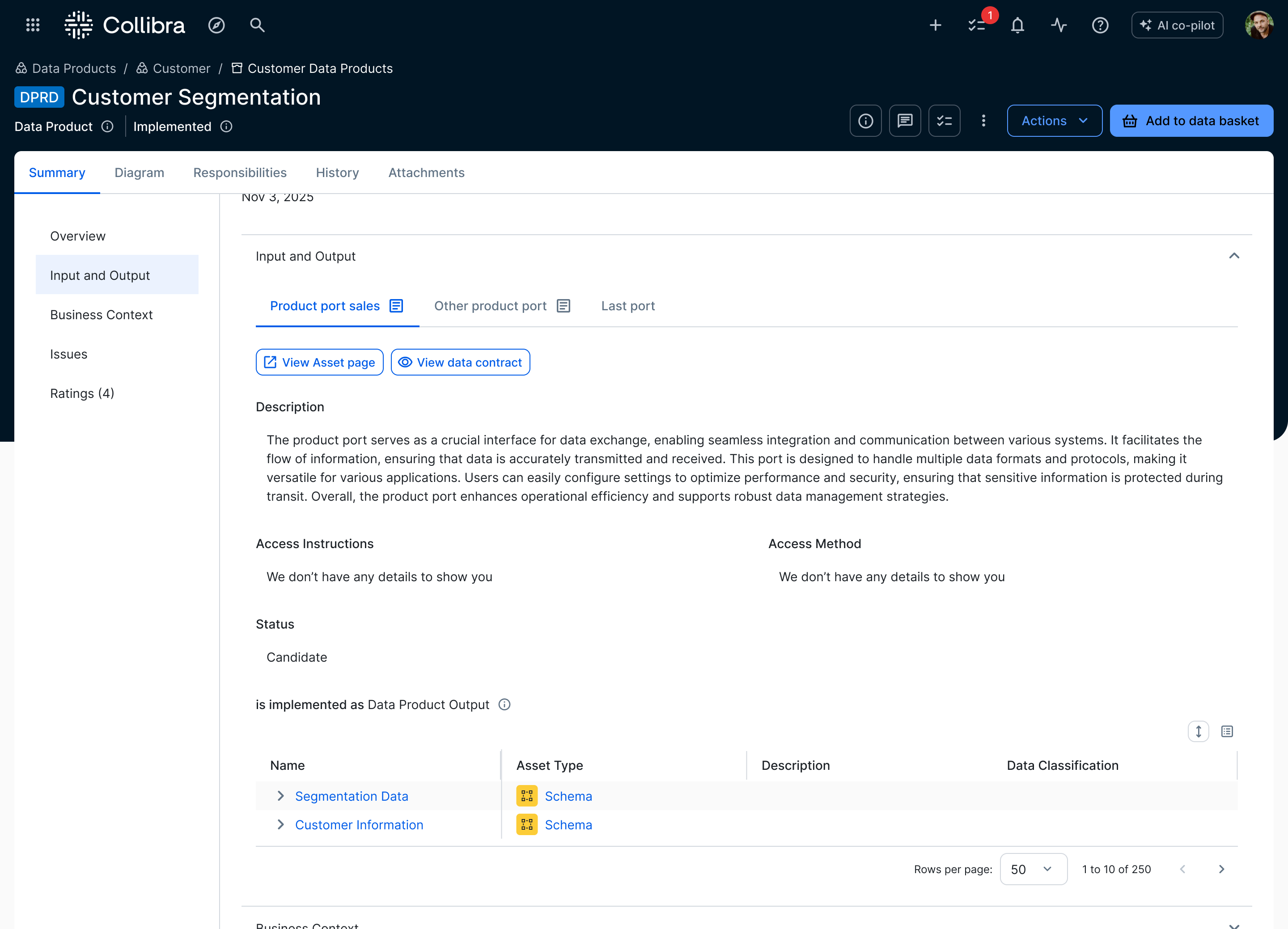
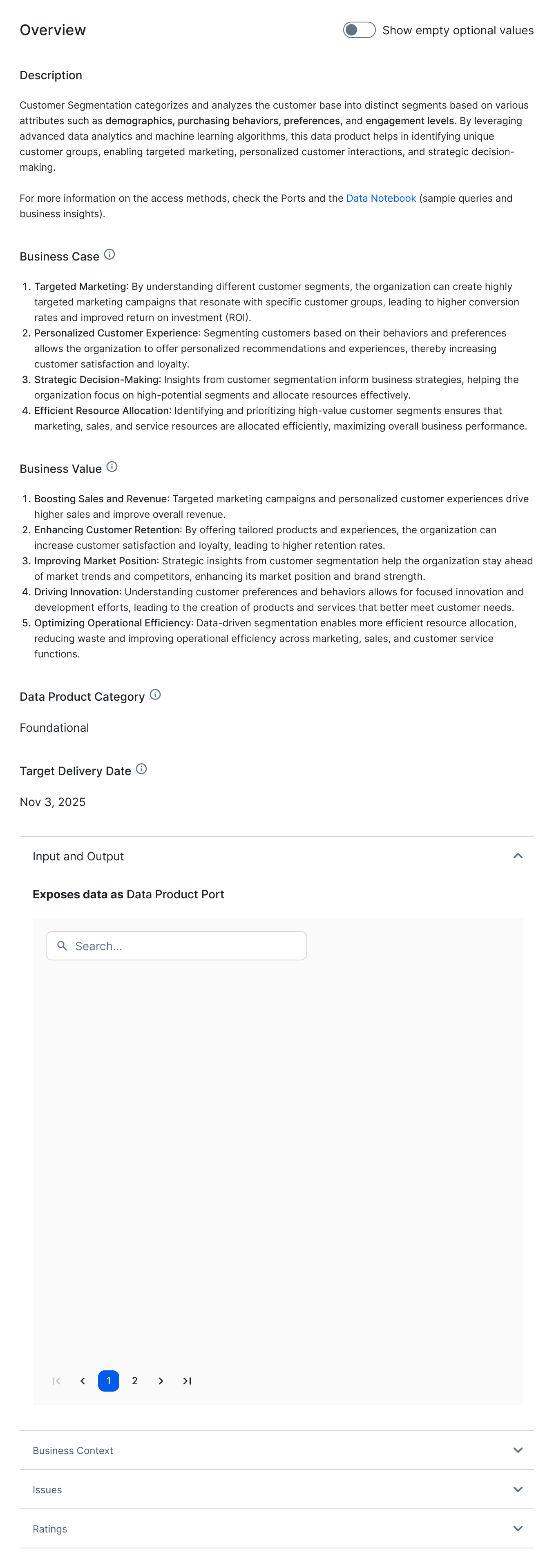
The brief was to bring order to a widget with no clear visual hierarchy. Attributes were hard to scan, and the viewer blended into the surrounding page. Each output port also needed its own tab, leaving little room to add more.
What shipped
Choose in one place
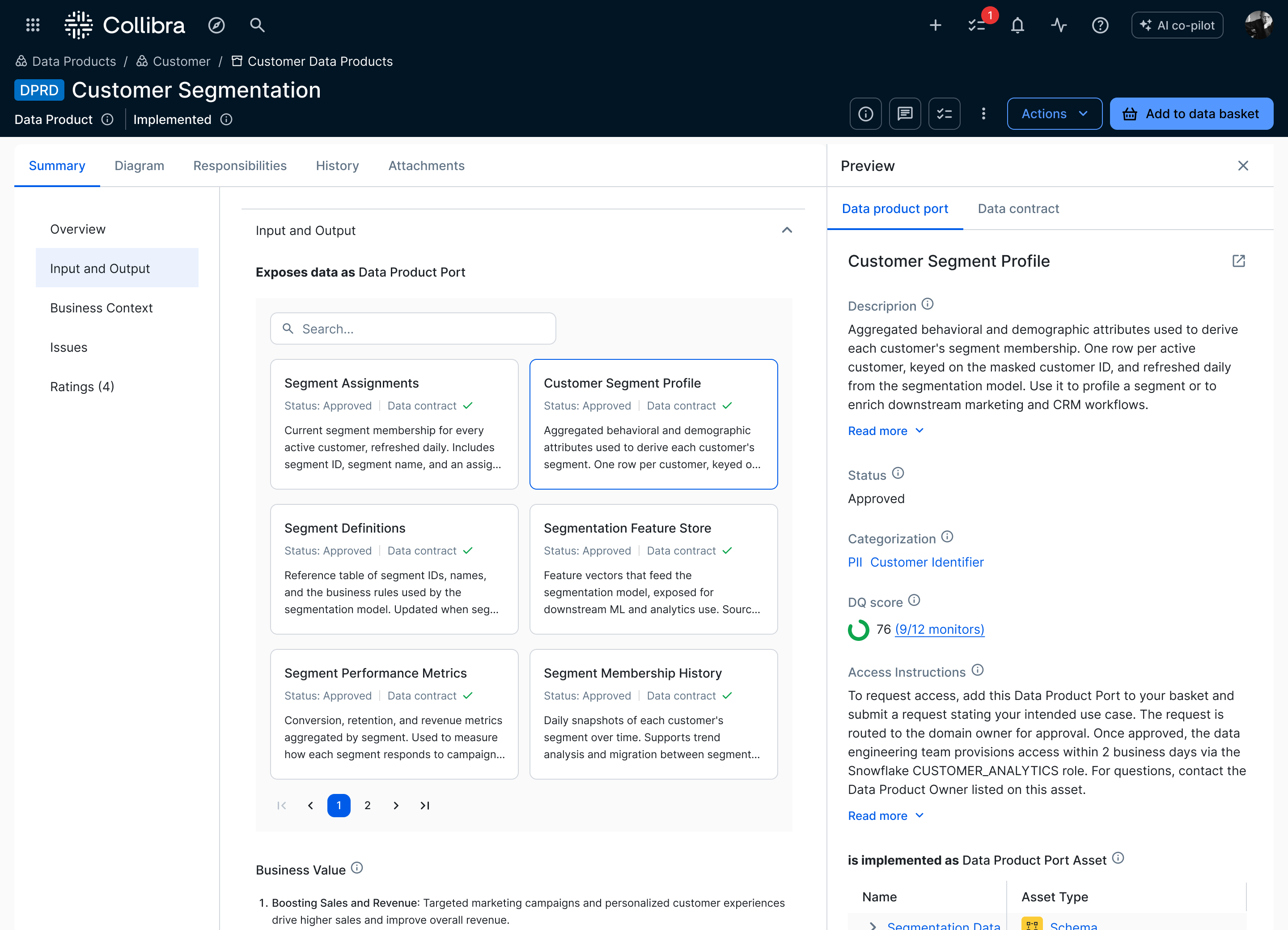
Cards support comparison; a side panel holds the selected port’s details and access action.
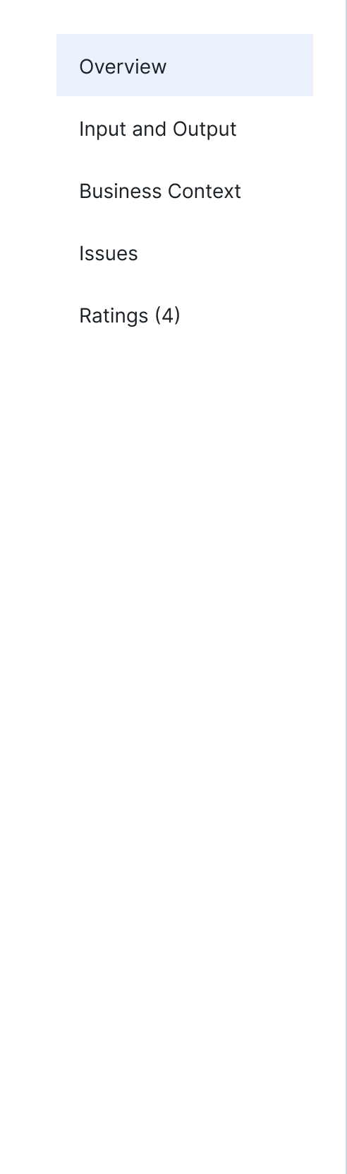
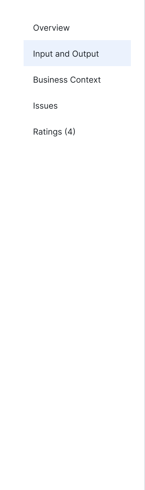
01Before01One port at a timeEach output port occupied a separate tab.02Two routesData contract stayed here; asset details opened elsewhere.02After01Card listFind an output port in one visible list.02In-page previewThe selected card stays beside the list.
Tap to compare
02Exploration
How the problem changed
01FindOpen a relevant data product
02CompareSee which outputs fit the need
03InspectCheck quality and contract
04ActRequest access with confidence
Collibra Output Port Viewer — how the problem changed
01Context
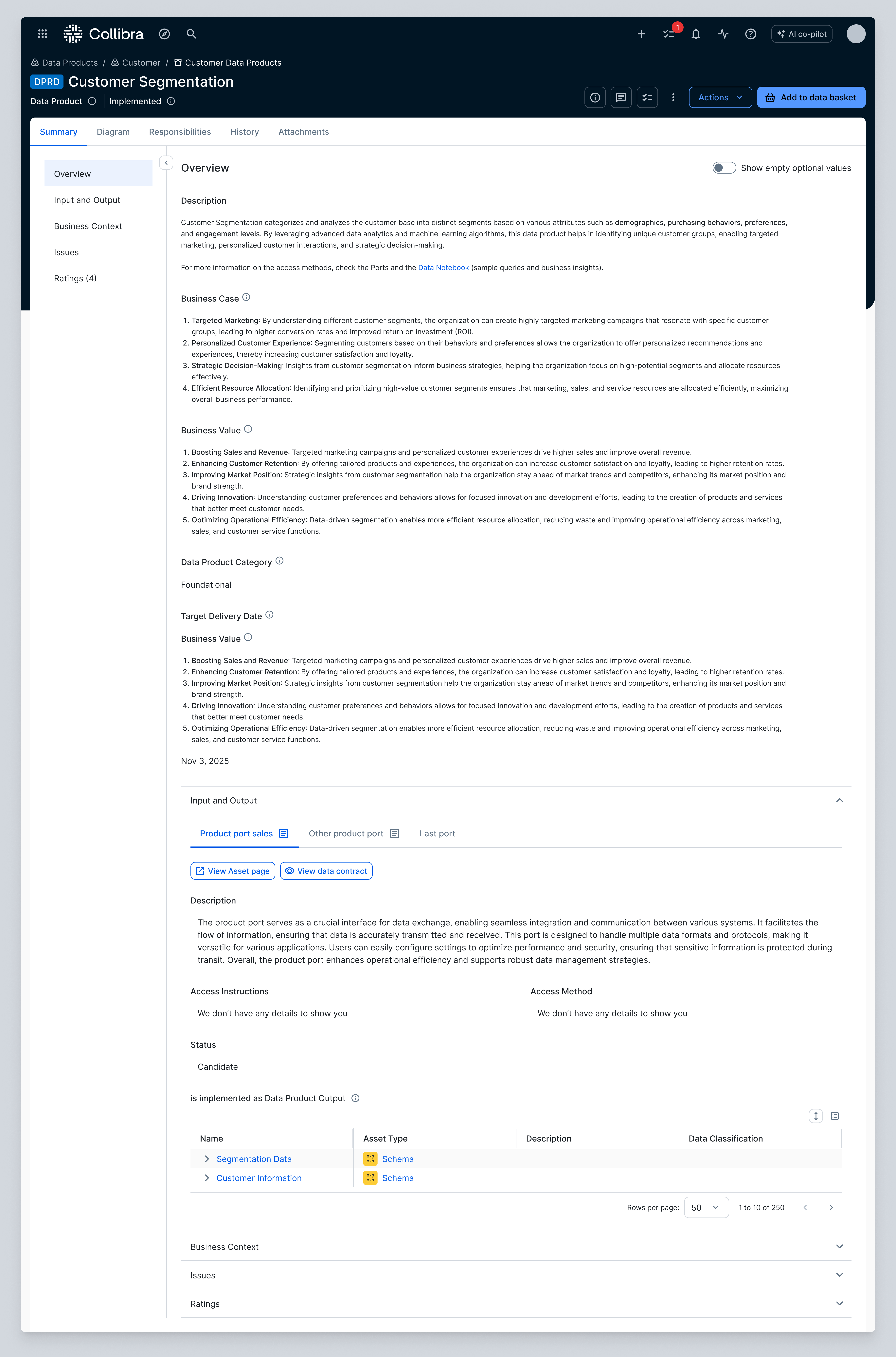
The viewer sat inside a crowded product page
02Hierarchy
The widget had no clear boundary
Its attributes, content and actions carried the same visual weight as the blocks around it.
03Interaction
Tabs showed one port at a time
Comparing ports meant clicking back and forth and remembering what changed.
04Navigation
Checking a port could send the consumer to another page
The data contract opened in a panel, but the full asset record required a separate page and a manual return.
05Research
Consumers need different information before and after choosing
I reviewed interview records in Dovetail to see what mattered at each step. Name, status, contract and a short description supported the choice. Quality, categorisation, access instructions and assets belonged in the selected port's details.
06Probes
The first pass cleaned up the existing widget
I regrouped the fields and separated the viewer from the surrounding content. It read better, but tabs still limited the consumer to one port at a time.
07Cards
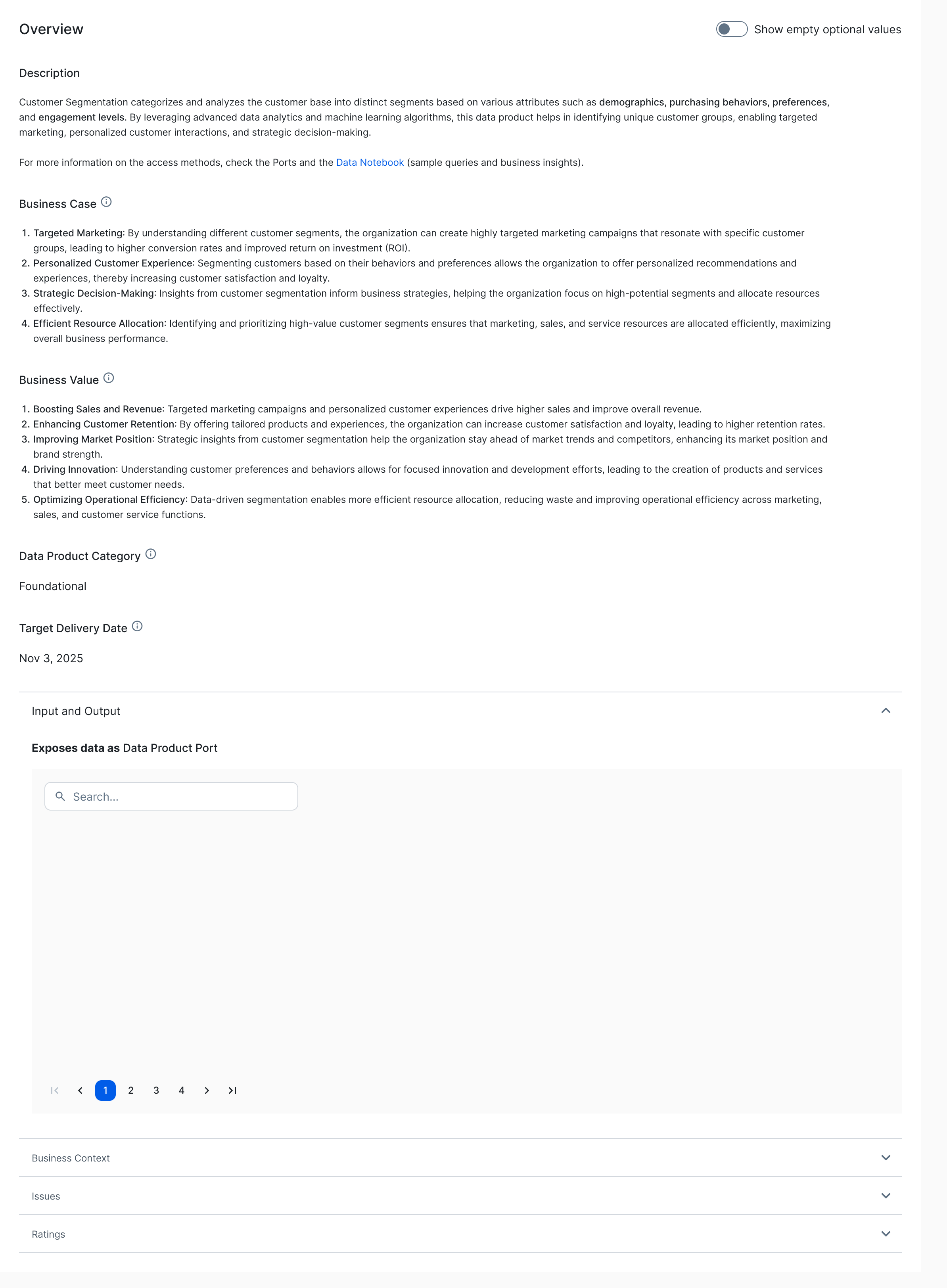
Cards made every port visible
Each port became a card with the same signals in the same place. Opening one replaced the grid with its details, so the comparison disappeared. I flagged a release risk: if consumers switched ports more than three times before choosing, names alone were not enough.
08Panel
A side panel keeps the other ports visible
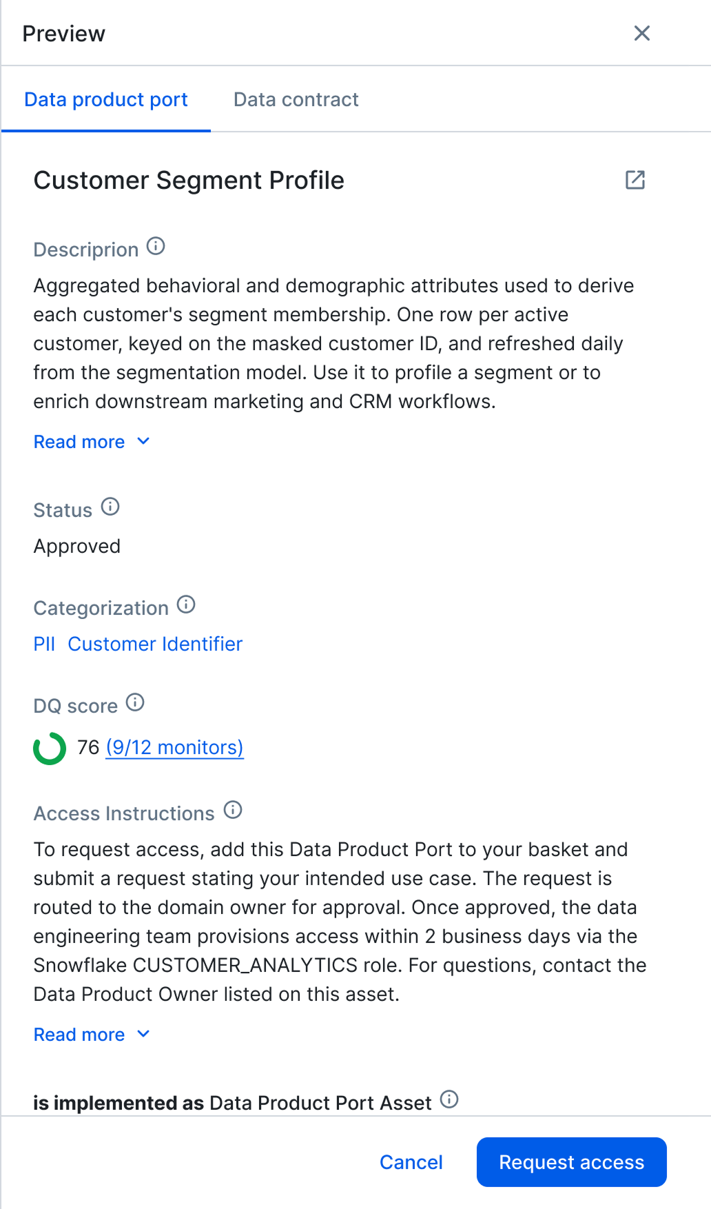
The cards stay in place while the selected port opens beside them. The contract sits in the panel; the full asset record remains available as a deeper link.
03Solution
The shipped flow
Collibra Data Product page — the output-ports redesign in context
01Context
The output ports sit below the product overview
02Signals
Every port shows the same four decision signals
Name, status, data contract and a short description.
03Select
Selecting a card opens the port details
04Panel
The other ports stay visible while the panel opens
The panel holds the contract, quality score, access instructions and request-access action.
04Outcome
The viewer shipped as part of the Data Product Area redesign
We defined success as reducing the time from finding a data product to requesting access. The new viewer supports that goal by keeping comparison, port details and the access action on the same page.
What continued after launch
I continued with two follow-ups: controls for which attributes appear on port cards, and a proposal to the design-system team for clearer boundaries between configurable page blocks.